A DOVE, a CAKE, and a CHIC all are found in a bar having FUN and PZZA. What happens next? Finance academics think they all beat the market.
It sounds too far-fetched and striking, but in a study published in 2009 by Gary Smith, Alex Head and Julia Wilson, the authors demonstrated that a substantial number of companies with clever ticket symbols have outperformed the market during 1984-2005. Now, with all due surprise you might wonder: was it simply a fluke instead? No. A decade on, a re-examination was performed for the subsequent years 2006-2018 and arrived at the same conclusion.
Perhaps you are still quite doubtful even now reading til this line. That was me, too! Actually not so much of doubtfulness but more like excitement to replicate and extend the result in my own way. Afterall, financial market in 2020 and 2021 was hit by Covid in many ways.
So follow me. Below I listed basic python codes to quickly visualise and extend the understanding of above finding by looking into the timeframe of 2006 til now. You might also be interested in a similar article of mine Fundamental Stock Analysis in Python
Let’s get started
A very first fundamental step to start our python notebook is to call relevant libraries
# Typical libraries for data manipulation and visualisation
import pandas
import datetime
import numpy
import matplotlib.pyplot as plt
from matplotlib import style
import plotly.express as px
import warnings
warnings.filterwarnings("ignore")
# For reading stock data from yahoo
import pandas_datareader as web
import yfinance as yf
# For time stamps
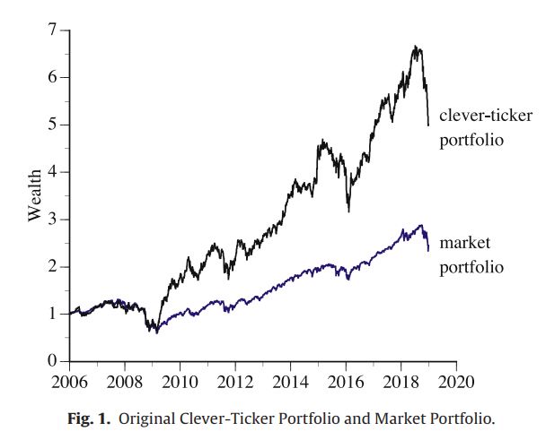
from datetime import datetimeAs per our plan to follow fig1, we will plot the returns (i.e. wealth) of an Equally Weighted Market Portfolio and an Equally Weighted Clever Portfolio.
Part A: Plotting Daily Return for Equally Weighted Market Portfolio
# Set up End and Start times for data grab
end = datetime.now()
start = datetime(2006,1,1)

# ^IXIC is the symbol of NASDAQ Portfolio in Yahoo! Finance

tickerData = yf.Ticker('^IXIC')
tickerDf1 = tickerData.history(period='1d', start = start, end = end )
tickerDf1 = tickerDf1.reset_index()
tickerDf1['ticker'] = '^IXIC'
tickerDf1.head()
Then we will get the data of first day into seperate dataframe for cummulative calculation
# Get the data for 3 Jan 2006
begRef = tickerDf1.loc[tickerDf1.Date == '2006-01-03']
def retBegin(val):
    start_val = begRef['Close']
    return (val/start_val)

tickerDf1['Market_Portfolio'] = tickerDf1.apply(lambda x: retBegin(x.Close), axis = 1)
tickerDf1 = tickerDf1.fillna(method='bfill')
tickerDf1.head()
Now just have to plot the figure
tickerDf1.plot(x = 'Date', y= 'Market_Portfolio', figsize = (10,5))
plt.title('Accumulative Daily Return of NASDAQ Index as Market Portfolio based on 2006',
          loc ='left', fontsize=15, fontweight=0, color='black')


plt.xlabel('Year', fontsize=15)
plt.ylabel('Wealth', fontsize=15)
plt.show()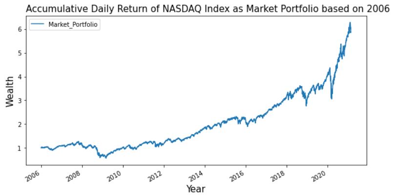
Part B: Plotting Daily Return for Equally Weighted Selected Portfolio
In this analysis, I repeated and extended the Smith 2020 findings with below tickers that were still trading in 2021. (Some firm went bust or ceased trading for reasons such as buyouts, mergers or delisting.)
SMITH ANALYSIS STOCK LIST 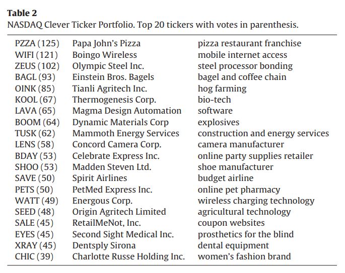
MY ANALYSIS STOCK LIST 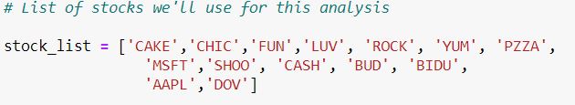
#List of stocks we'll use for this analysis

stock_list = ['CAKE','CHIC','FUN','LUV', 'ROCK', 'YUM', 'PZZA',
                'MSFT','SHOO', 'CASH', 'BUD', 'BIDU',
                'AAPL','DOV']

prices = web.DataReader(stock_list, 'yahoo', start, end)['Close']
prices = prices.reset_index()
Here, I perform an alternative way of calculating cummulative returns
prices['Portfolio'] = prices.iloc[:,1:].sum(1)
prices['Portfolio_return'] = prices['Portfolio'].pct_change()
prices['Clever_ticket_portfolio'] = (1 + prices['Portfolio_return'].fillna(0)).cumprod()
Similarly, plot the chart:
prices.plot(x = 'Date', y= 'Clever_ticket_portfolio', figsize = (10,5))
plt.title('Accumulative Daily Return of NASDAQ Index as Market Portfolio based on 2006',
          loc ='left', fontsize=15, fontweight=0, color='black')


plt.xlabel('Year', fontsize=15)
plt.ylabel('Wealth', fontsize=15)
plt.show()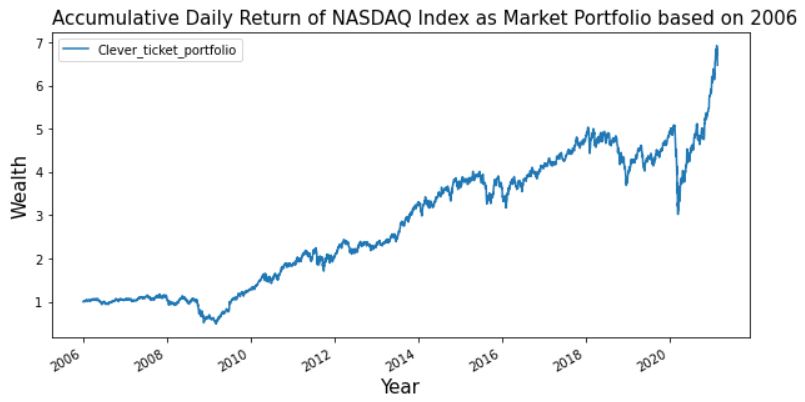
Now that we are able to plot the two portfolios separately, we want to combine them in one chart only.
final = pd.merge(tickerDf1, prices, on = 'Date')
ax = plt.gca() # gca stands for 'get current axis'

final.plot(x = 'Date', y= 'Clever_ticket_portfolio', figsize = (10,5), ax=ax)
final.plot(x = 'Date', y= 'Market_Portfolio', figsize = (10,5), ax=ax)
plt.title('Accumulative Daily Return of NASDAQ Index as Market Portfolio based on 2006',
          loc ='left', fontsize=15, fontweight=0, color='black')


plt.xlabel('Year', fontsize=15)
plt.ylabel('Wealth', fontsize=15)
plt.show()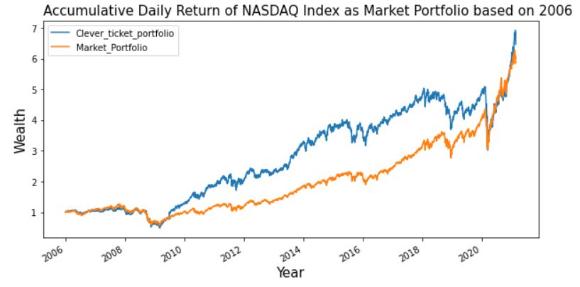
Evident by the chart, we can conclude that yes Clever ticket portfolio had outperformed the market, but their supreme time seems over now in 2021 where Covid added a new flavour to the market in many ways…
You can find my notebook code here (https://github.com/Rachelios/A-cup-of-tea-and-a-good-book/tree/master/Stock%20Markets)